Product design and campaign for Dětský Ječmen
We worked on a new visual style, packaging design, and the whole marketing campaign for a new product for children.
Green Ways
Green Ways is one of the largest European producers and distributors of green goods. They sell green barley and chlorella via ethical network marketing and through personal interaction between sales representatives and end users. Green Ways products are among the best of their kind on the market.
Client’s requirements and our mission
Green Ways was planning the launch of a new product for children in the spring of 2019. Strawberry flavoured green barley was supposed to be the first supplement for children in the company’s portfolio. Our role was to provide them with the best image, visual style, and promotional campaign.
We worked on the visual and content concept for the new product named Dětský Ječmen (Barley for Children). The concept was implemented in the packaging design, merchandise, printed materials, and the overall marketing strategy for the launch.
Project twam:
- Project leader:
Veronika Duchoňová - Visual idea:
Veronika Šišková, Ivan Kebeleš - Copywriting:
Tereza Ticháčková, Veronika Duchońová - Design & DTP:
Veronika Šišková, Ivan Kebeleš


The animal idea
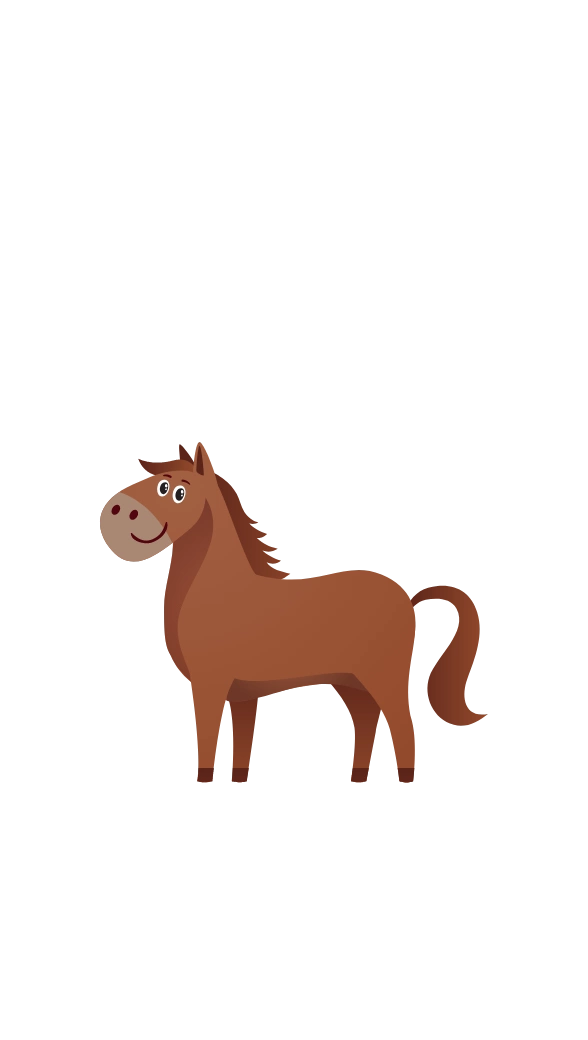
Animal mascots were picked as the pillar of the campaign, creatures that would serve as guides through the world of healthy eating. We proposed a group of animal heroes to be associated with Dětský Ječmen. This group became the main motif of the marketing campaign.
All animals were original creations and copyright illustrations. The first guide and main hero at the market launch of the product was the giraffe.

Timeline of the creative work
Five new animal friends have ultimately joined the giraffe. For all the mascots we carefully defined their traits and roles.
The animals were also processed in a graphic study, allowing us to show them expressing emotions, in perspective and in motion.

New packaging
The basic idea was not to completely redesign, but rather innovate the existing packaging design and add a new marketing concept.
The packaging for Dětský Ječmen followed the original colour scheme, with white being the new dominant colour; the main reason for the change being that the package was supposed to be immediately distinguishable from other Green Ways products.

Product and packaging design
The children’s product features a new comprehensive line of packaging. The new design was reflected on jars, boxes, stickers and adhesive tape, to generate maximum visibility for the new products among Green Ways customers.

Online campaign
The launch of the product was marked by a massive marketing campaign showcasing our visual concept.
The animals became central characters in a promotional video and Facebook stories. They were also featured in the corporate magazine, product website, and a PPC campaign.

Merch and gifts
The new Green Ways product was boosted by a set of advertising items and gifts. With the launch of the product, the company added to shipments a “Concentration” card game and shaker, and later also a stuffed giraffe and cloth sachets.

All animals


